
My First Cover
A Wizard in Bedlam by Christoper Stasheff.

The first book cover I ever did was for A Wizard in Bedlam by Christoper Stasheff.

I was working at Disney Studios at the time, and I started sending out samples by mail. That was mainly work I had done in art school at Art Center College of Design. Don Wolheim, of DAW books, was the first to bite, and he sent me Stasheff’s manuscript. I did the cover and sent it in, but I didn’t understand there would be a long delay until the book was published. It was months of waiting, looking at the mail in anticipation every day. Finally, it arrived, and I was a REAL book cover artist!
I posed for the figure with the cravat, and my first wife’s father, Marty, posed for the giant holding the staff. I still think it is an alright cover, although I wish I had made the background ship more dimensional.
A Wizard in Bedlam has been redone by other artists many times. Since it was part of a popular series, it has remained in print all these years. Here is a sampling of the other covers done for the book, one by Nick Jainschigg imitating Darrell Sweet’s work. I think Steve Hickman’s cover is the best of the bunch, with Gino D’Achille’s a close second.

I did 14 books for DAW in the early part of my career, including a number of covers for Jack Vance, one of my favorite writers.
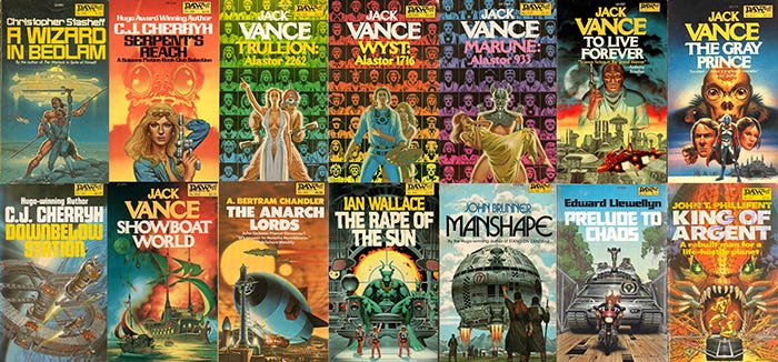
All of my DAW covers
Don Wolheim and I had a falling out when I was put under contract by Del Rey. Don felt that Del Rey stole some of his best artists, including Michael Whelan, and I wasn’t sensitive enough to maintain both relationships. I owe a lot to Don, but since he died in 1990 before I had a chance to tell him, all that will remain unsaid.

Don Wolheim
I loved working with Don. A funny story I have about him was when I visited him in his office in the 1980s. We were talking about what we were going to do over the weekend. Don mentioned he had tickets to see “Sugar Babies,” a hot Broadway show at the time. He pulled out the tickets with great pride, looked down, and announced they were for the previous night. He had missed the show.
Don was his own art director, and he was an artist’s favorite. I don’t think Don ever asked for a change in a cover in all the years I worked for him. When I submitted sketches, he would choose one, and not ask for changes in the sketch or final. Many art directors ask for changes, in both the sketches and the finals, but rarely make the final better. Keeping your hands off the artist’s vision makes them feel trusted by the publisher, and not micro managed. It seems like the bigger the company, the more changes they would ask for. Independent publishers, like Don Wolheim and Jim Baen, would let the artists “do their thing,” and both companies had better covers for it.
I loved DAW’s yellow spines. People made fun of them, but it made the books instantly recognizable on the shelves. Unfortunately, when Don’s daughter took over the line after his death she abandoned them. Now DAW books look just like all the others on the shelves. DAW also had a numbering system, so each book had the DAW logo on the cover, and a number. I thought that was a clever way to build loyalty, since as a kid I wanted to have all of them. That too was abandoned after Don died.
No apology needed! I'm flattered, in fact. I agree with you about the angle, and the fact the Darrell never used it, but it was the only way I could think to incorporate the elements required. If I had the chance to do it over again.... The illustrators mantra.
Late 20th century. That world, while not gone, is much diminished now. I suspect, just as digital replaced traditional illustration, and photography replaced both, as AI improves, publishers will be using more and more of it to replace human creativity and improve their bottom line